DULUX UNVEILS THE RHYTHM OF BLUES™ COLLECTION
AS ITS COLOURS OF THE YEAR 2026
For 2026, Dulux is asking architects, specifiers and designers to dance to the Rhythm of Blues™ with its new trio of shades. For the first time ever, Dulux has selected a colour family of the year. The harmonious collection of signature indigos reflects various moods, making them suitable for any setting.
The Dulux Colours of the Year 2026 are three versatile blues: light Mellow Flow™, dark Slow Swing™ and vibrant Free Groove™. They were chosen following the company’s extensive annual trend research and provide architects, specifiers and designers with a selection of shades that reflect the mood of every environment.
AkzoNobel’s Global Aesthetic Centre has been translating trends into desirable colours for more than 30 years. Its annual ColourFutures™ trend forecast meeting brings together in-house experts, international architects, designers and journalists to share insights into how people’s reactions to the world impact colour choices. For the first time, three colours were selected which all have common ground, but each bring a unique quality.
From the timeless, soothing qualities of Mellow Flow™ to the meditative, calm and grounding nature of Slow Swing™, and the vibrant, exciting and uplighting Free Groove™ there is a shade to suit any brief. Used individually or in combination, the Colours of the Year 2026 offer professionals the flexibility to create multiple expressions of energy, mood and pace across every sector.
The Rhythm of Blues™ collection is also complemented by interior and exterior palettes, making it easier than ever for professionals to find the right colours for their project.
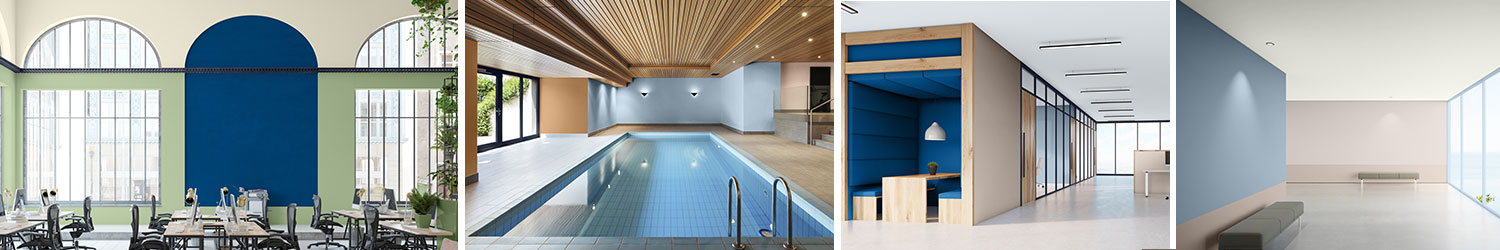
Interior colour palettes:
- A Slow Colour Story: Natural shades of blue and brown, this family of wintery earth tones can help create contemplative spaces that quieten the mind and feel restorative. This palette works particularly well in office or healthcare settings – environments where people need respite from noise and stress. The meditative dark blue is the hero in this palette.
- A Flow Colour Story: Here, the family of blues, with airy sky blue as the hero, is joined by warm and tactile earth shades of terracotta, brick and clay. These familiar, natural colours can help create spaces that feel comfortable and harmonious. They work well in residential or hospitality settings where people want to come together and feel supported.
- A Free Colour Story: A combination of multicolours with the balancing blues, this palette feels young, energetic and uplifting. It can help bring momentum to a space and create a fun, ‘anything-goes’, forward-looking feel. It works well in settings where people seek stimulation and fresh ideas – such as education and office spaces. The energising colour in this palette is the cobalt blue.
Exterior colour palettes:
- A Slow Colour Story: Recalling the quiet colours of a wintery landscape, this palette is understated and peaceful. The blues and soft browns work naturally in any environment and can bring a sense of stillness and stability to an exterior scheme. Painted in these tones, even a contemporary building will feel rooted and timeless.
- A Flow Colour Story: Set against warm, tactile tones of terracotta, brick and clay, the family of blues takes on a cooling and balancing role here. Inspired by the shades of the world around us, this palette can help create an exterior that feels in tune with its surroundings, and a building that feels harmonious.
- A Free Colour Story: With the hero deep, cobalt blue, this mix of multicolours offers energy and momentum to any exterior scheme. Modern, fresh and uplifting, it can help to bring an experimental, light-hearted and creative feel to any building project, and give it a sense of personality and individuality.
Dawn Scott, Dulux Trade Senior Colour Designer at AkzoNobel, said:
“With the Rhythm of Blues™ collection, we have captured the different ways colour shapes people’s daily experiences. From creating moments of quiet reflection to sparking energy and creativity, each of the three colour stories offers architects, specifiers and designers with the inspiration to create spaces that feel in tune with the needs of their users.
“For example, the Free Colour Story lends itself perfectly to education settings. As schools, colleges and universities evolve away from walled in classrooms towards more fluid and collaborative learning settings, the vibrant cobalt and energising accents of yellow and green provide energy and momentum. Applied thoughtfully, these tones can inspire curiosity, engagement and creativity to help students and staff feel part of an environment that is open and connected.”
Marianne Shillingford, Dulux Creative Director and Colour Expert at AkzoNobel, explains:
“Blue has been the world’s favourite colour for years – but it’s far from one note. It delivers a sense of fluidity, relief, stillness and freedom, which is exactly what’s needed in today’s fast-paced world.
“It’s roots in nature give us something to connect to, as well. When we see light blues like Mellow Flow™, we might think of soothing springs or sunrise skies, for example, or be reminded of the deep ocean’s chilled stillness with a dark blue like Slow Swing™. Whereas Free Groove™ offers a more intense heat, like that of summer pool parties. Some of us are slowing the beat to recharge and find balance, while others are looking to crank up the volume and create spaces that are simply fun.
“Rhythm of Blues gives us the opportunity to do both – it’s a family of colours that can soothe, steady or excite, depending on how you play it. This collection offers colours you can find peace in, and colours you can dance to, centred around three distinct rhythms to offer endless possibilities for changing the pace of your space.”
To support architects, specifiers and designers and provide additional guidance on the use of the Rhythm of Blues™ collection, Dulux has created the Dulux Trade Colours of the Year 2026 Specifier Guide. This includes inspiration that can help create the perfect space across any sector.
Professionals can also use the Dulux Trade Colour Schemer for colour inspiration
or to create specifications for projects
For further advice, contact the Dulux Commercial Colour Services team.
The Dulux Colours of the Year 2026: Rhythm of Blues™ collection and colours from the accompanying palettes will be available for purchase from September 9, 2025.
 CLICK HERE for more information
and FOLLOW DULUX HERE
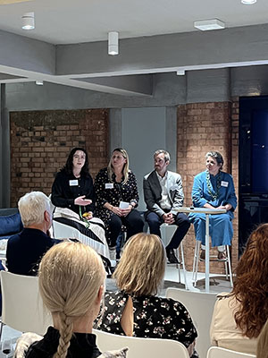 “Events like our Inclusive Spaces, Sustainable Places: A New Era of Design Thinking panel discussion at Allermuir are crucial for bringing inclusive design to the fore and educating the industry on best practices. The event exceeded expectations and generated insightful conversations and ideas around how design can be more inclusive. We’re committed to continuing these important dialogues to shape spaces that work for everyone.”